Introduction
“My site is Bortle 4.” You hear this constantly in amateur astronomy circles. Someone describes where they observe, and the Bortle number follows automatically — shorthand for how dark the sky is, how much deep-sky work is possible, how ambitious you can be with your target list. People look up their address on an online map, see a color and a class number, and walk away with a fact. Bortle 4. Noted.
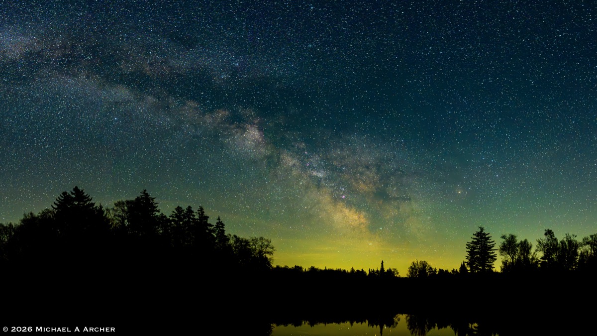
The problem is that it’s not quite a fact. It’s a simplification of a simplification of a simplification — and the gap between the number and the actual sky you’re observing under is large enough to matter. A location doesn’t have a Bortle rating. It has many: one for each direction you point the telescope, one for each phase of the Moon, one depending on whether you asked a satellite, an instrument, or your own eyes. Understanding what “Bortle 4” actually means requires understanding where the number comes from — and where it breaks down.
This article traces that whole chain: the original qualitative scale, the instruments used to quantify it, the contested calibration that connects them, the satellite data that popularized it, and the ways all three methods can give different answers for the same patch of sky on the same night.
What Bortle Actually Is
In February 2001, amateur astronomer John Bortle published an article in Sky & Telescope titled “Gauging Light Pollution.” Bortle, a veteran observer from New York, had spent decades studying comets and variable stars from skies ranging from exceptional to appalling. His goal was practical: give observers a simple, instrument-free way to characterize a sky so they could compare notes meaningfully and set realistic expectations for a night’s work.
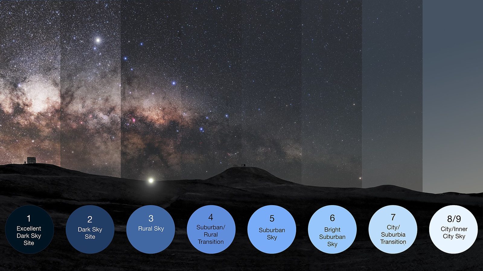
The result was a nine-point scale. Each class is defined by what you can and can’t see with your naked eye and through binoculars — no instruments required. The classes run from 1 (the best possible sky on Earth) to 9 (an inner-city night so bright that constellations are hard to recognize).
The most useful single test across the scale is M 33, the Triangulum Galaxy. It has a total visual magnitude of about 5.7 — theoretically within naked-eye reach — but its light is spread over nearly 1.5° of sky, giving it extremely low surface brightness. That makes it exquisitely sensitive to sky background brightness, changing from obvious to invisible over just a few Bortle classes.
| Class | Name | Key visual benchmarks |
|---|---|---|
| 1 | Exceptional | Zodiacal light casts faint shadows; M 33 obvious; airglow visible |
| 2 | Truly dark | Gegenschein prominent; M 33 easy direct vision; aurora visible from mid-latitudes on quiet nights |
| 3 | Rural | M 33 visible direct vision; some light pollution glow on horizon; zodiacal band visible |
| 4 | Rural/suburban transition | M 33 difficult, requires averted vision; zodiacal light gone; distinct domes over cities |
| 5 | Suburban fringe | M 33 not visible; Milky Way present but washed out overhead; obvious glow in multiple directions |
| 6 | Bright suburban | Milky Way barely visible at zenith; M 13 hard to find without chart; light domes everywhere |
| 7 | Suburban/urban | Milky Way completely invisible; M 31 faintly visible; entire sky gray-white |
| 8 | City | Only major constellation patterns recognizable; M 31 invisible |
| 9 | Inner city | Orion barely recognizable; only a handful of stars visible; sky orange |
Notice what’s absent from Bortle’s original scale: numbers. No magnitudes per square arcsecond, no instrument readings, no quantitative thresholds. The scale was, by design, purely observational. You walk outside, look at M 33 and the zodiacal band and the Milky Way core, and place yourself on the scale. The entire calibration is in your eye and your experience.
That’s a feature, not a bug. But it creates a problem when you want to compare notes with someone in another state, or track how a site changes over years, or look up a location without visiting it. For that, you need numbers.
Putting Numbers on It: the Sky Quality Meter
The instrument that gave Bortle classes their numeric backbone is the Sky Quality Meter (SQM), a compact handheld device such as the one made by Unihedron. You point it at the zenith, press the button, and it gives you a reading in about a second. The reading is in magnitudes per square arcsecond — written mag/arcsec² — which quantifies how bright the sky background is in a tiny patch of sky.
The unit inherits the counterintuitive direction of the astronomical magnitude scale: larger numbers mean darker skies. A reading of 22.0 mag/arcsec² is a very dark, pristine sky. A reading of 18.0 is a city. Below 17 means you’re somewhere that only the brightest stars are visible overhead.
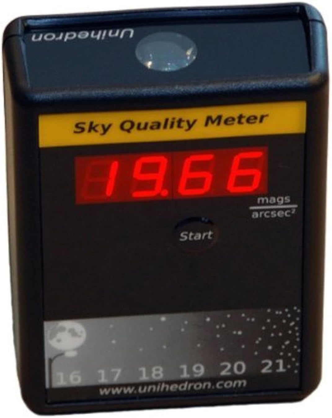
A natural sky with no artificial lighting whatsoever would read approximately 22.0–22.5 mag/arcsec². Our best sites in the Berkshires typically read 20.5–21.3, depending on the night and conditions. Each magnitude per square arcsecond represents about a 2.5× change in sky brightness — so a site that reads 21.0 has a sky background roughly six times brighter than a site reading 22.8.
The SQM made it possible, for the first time, to put an objective number on a Bortle class. Observers could now say “our site reads 21.1 — that corresponds to Bortle 4” rather than debating whether the zodiacal band was quite faint enough to qualify for Class 3. The number travels. The eyeball assessment doesn’t.
The Calibration Problem
Here is where the story gets interesting — and where most online resources quietly gloss over the messiest part.
Bortle’s original 2001 article contained no SQM values. The numeric correspondence between mag/arcsec² readings and Bortle classes was developed entirely after the fact, by different researchers and organizations working independently. And they didn’t all agree.
When you look at where the SQM→Bortle correlation comes from, the trail goes cold faster than you’d expect:
Unihedron (the manufacturer of the SQM) does not publish an official SQM-to-Bortle table. When asked, they explicitly say: “We believe that if you check the Wikipedia Bortle Dark-Sky Scale link, the descriptions associated with each mag/sq arcsec are sufficiently detailed that you could draw up a pretty decent correspondence.” In other words, they defer to a crowd-sourced encyclopedia.
Wikipedia’s Bortle article does include a table with SQM values, and since Unihedron points there, it functions as the de facto standard. But the table has evolved over time and isn’t backed by a published primary source. It’s the community’s best attempt at the calibration — useful, widely cited, but ultimately empirical.
lightpollutionmap.info, the site most people use to look up their location’s Bortle class, uses its own calibration that differs meaningfully from Wikipedia’s — particularly at the dark end of the scale. How do we know? By clicking on hundreds of locations and recording exactly where their assigned Bortle class changes as sky brightness varies. The class-change thresholds don’t match Wikipedia’s.
DarkSky International (formerly the IDA) uses its own sky brightness thresholds for certification tiers — Gold (>21.75 mag/arcsec²), Silver (21.0–21.74), Bronze (20.0–20.99) — which are independent of the Bortle scale entirely but provide real-world anchors.
The peer-reviewed literature (e.g., Birriel et al., JAAVSO, 2010) tends to use the correlation from darkskiesawareness.org’s “Sky Brightness Nomogram” — yet another independent derivation.
The table below shows how these sources compare. No single column represents the authoritative answer.
| Class | Current Wikipedia | lightpollutionmap.info¹ | DarkSky Intl. tier |
|---|---|---|---|
| 1 | 21.76–22.0 | > 21.99 | — |
| 2 | 21.6–21.75 | 21.89–21.99 | Gold (> 21.75) |
| 3 | 21.3–21.6 | 21.69–21.89 | — |
| 4 | 20.8–21.3 | 20.49–21.69 | Silver (21.0–21.74) |
| 4.5² | 20.3–20.8 | — | — |
| 5 | 19.25–20.3 | 19.50–20.49 | Bronze (20.0–20.99) |
| 6 | 18.5–19.25 | 18.94–19.50 | — |
| 7 | 18.00–18.5 | 17.00–18.94 | — |
| 8/9³ | < 18.00 | 15.00–17.00 / < 15.00 | — |
¹ Derived by recording Bortle class-change points on lightpollutionmap.info across a large number of locations. Not published by the site; the author’s own reverse-engineering.
² Wikipedia includes a Class 4.5 (suburban/rural transition) not found in most other sources.
³ Wikipedia does not distinguish Classes 8 and 9 by SQM value; both fall below 18.00.
A few things stand out. The lightpollutionmap.info calibration is significantly more conservative at the dark end: their Class 2 runs only from 21.89 to 21.99, while Wikipedia’s spans 21.6 to 21.75. A site at 21.7 mag/arcsec² is Class 2 by Wikipedia but Class 3 by lightpollutionmap.info. The sources disagree by a full class at readings that many observers would describe as quite good skies.
The practical upshot: when someone tells you their site is “Bortle X,” you don’t know which calibration they used — or whether they used an instrument at all, or whether they just clicked on a map. All of these are valid, and all of them can give different answers.
One additional wrinkle worth knowing: consumer SQM instruments vary by approximately ±0.3–0.5 mag/arcsec² from unit to unit, and measurement uncertainty on a single reading is around ±0.2 (Cinzano 2005, ISTIL Internal Report No. 9). The calibration gap between sources is often smaller than the instrument variation itself.
Satellites: A Third Way to Get a Number
The most common way people assign a Bortle class to a location — visiting a site like lightpollutionmap.info and clicking on a map — doesn’t involve an SQM at all. It uses satellite data.
The primary data source is the VIIRS instrument (Visible Infrared Imaging Radiometer Suite) aboard the Suomi NPP satellite, which measures upwelling artificial light from orbit. lightpollutionmap.info takes that raw brightness data and converts it to sky brightness predictions in mag/arcsec² using a radiative transfer model. It also incorporates a terrain model so the predictions account for local topography — hills blocking or reflecting light.
This is an extraordinary tool, and we’ll use it extensively below. But it produces numbers that are systematically different from what you’d measure standing on the ground with an SQM:
VIIRS model predictions run 0.3–0.5 mag/arcsec² higher (darker) than ground-level SQM readings at the same location. This is a consistent, well-known offset — not random error. The satellite sees the light going up and applies a model to estimate what the sky looks like from below; the SQM stands below and measures it directly. The two perspectives don’t agree perfectly.
This means: if the satellite model says your zenith is 21.6 mag/arcsec², your ground SQM will likely read around 21.1–21.2. Under Wikipedia’s calibration, that shift moves you from Class 2 to Class 4. Under lightpollutionmap.info’s own calibration, 21.6 is Class 3, but your actual ground reading of 21.1–21.2 is Class 4. Either way, you drop classes.
This is why the Bortle class assigned by lightpollutionmap.info is almost always more optimistic than what an observer with an SQM reports for the same site. The map shows a VIIRS-derived prediction; the SQM measures what’s actually there.
A Location Doesn’t Have Just A Bortle Rating
Here is the point that almost never gets stated plainly: a single Bortle number for a location is an abstraction, and often a misleading one.
Direction matters
The Bortle scale was originally intended to characterize the sky at the zenith, or the overall quality of the sky above roughly 45° altitude. But an all-sky map tells a very different story. Look at the polar projection view for any of our Berkshire observing sites, with zenith at center and horizon at the rim. The zenith reads one thing; the horizon reads something completely different.
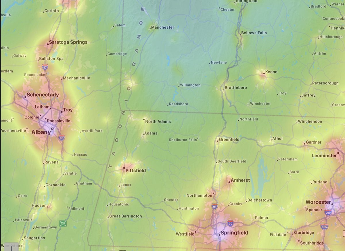
The regional picture explains the all-sky patterns. Three major sources — Albany to the west, Pittsfield in the center, Springfield to the southeast — hem in the entire region. What varies from site to site is how much terrain shielding each location gets from each source.
To understand why terrain matters (and why it doesn’t fix everything), you need to understand where the light in a dome actually comes from. When a city sends light upward, some of it travels at low angles and reaches your eye directly across the landscape — this is the near-horizon direct component. But most of a dome’s glow comes from a different path: city light goes up, scatters off aerosols and air molecules at altitude, and some of that scattered light redirects toward you from above. This backscattered component arrives from 5–15° above the horizon, not from the ground.
Terrain can block the direct component very effectively. A ridge in the direction of Springfield can intercept the lowest few degrees of that horizon, cutting the direct light substantially. What terrain cannot block is the backscattered component — it comes from above the ridge and simply arcs over it. For a major metro area, this component accounts for roughly half the dome brightness you see.
The practical result: terrain shielding can reduce a dome by 30–50% and may make certain directions in the sky genuinely usable that would otherwise be washed out. But it cannot eliminate a large source, and the improvement is greatest on transparent nights when the direct component dominates.
High ground, open horizon: Windsor Peak, Windsor MA
Windsor Peak sits at modest elevation with nearly 360° of open horizon. With no terrain to intercept any direction, the map shows the underlying pollution field unmodified.
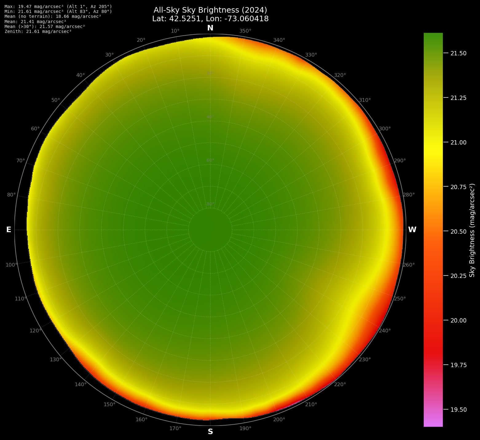
The result is a smooth radial gradient — uniformly dark at zenith, uniformly compromised at every point on the horizon. Pittsfield is the worst direction (SSW, Az 205°). The zenith may say 21.61, but the horizon in that direction is reading several magnitudes brighter. Anyone pointing a telescope toward Sagittarius or toward the southwest is observing in a much worse sky than the zenith number implies.
Terrain-shielded sites: Cummington and Readsboro
Arunah Hill in Cummington has a nearly identical zenith reading to Windsor Peak (21.64 vs. 21.61) but a completely different all-sky pattern.
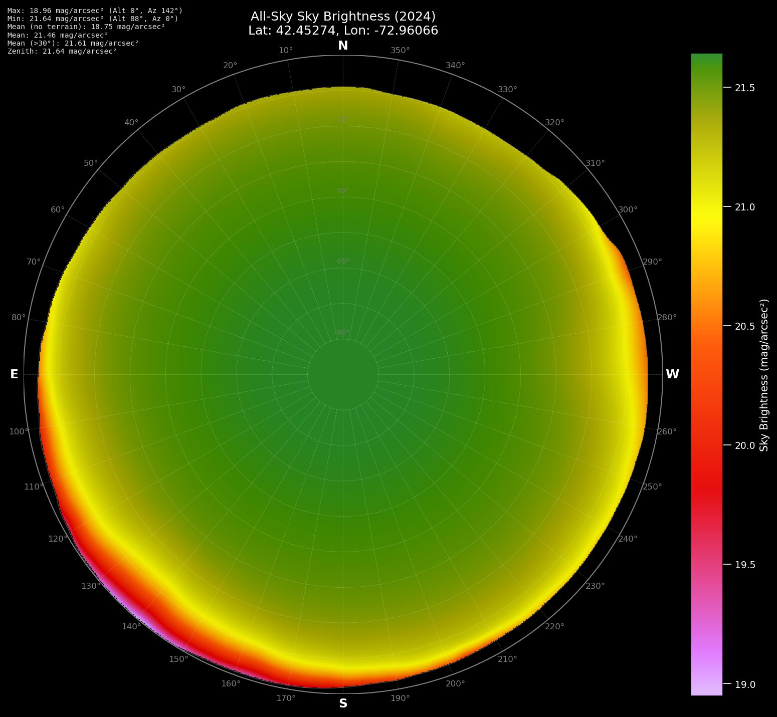
The southeastern horizon collapses to around 18.96 mag/arcsec² — Springfield’s direction — but that spike is tightly localized. Hills to the south and southeast intercept the direct component of Springfield’s dome before it reaches the observing field. The asymmetry is the terrain shielding made visible. Without it, the all-sky mean would be dramatically worse; with it, the mean is 21.46 — nearly three magnitudes better than the rim alone would predict.
The same zenith reading, very different usable sky.
The Readsboro site in southern Vermont adds distance to the shielding equation.
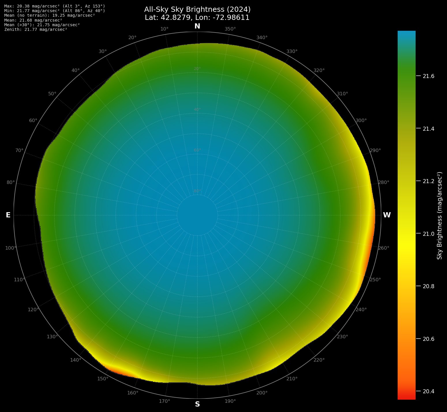
The map is almost entirely in the blue-green band — the best of the group. Even the worst direction (SE horizon, ~20.38 mag/arcsec²) stays in the green range. Springfield is visible as a slight warm patch at 90 miles out but cannot dominate from that distance.
The Mt. Greylock question
“Why don’t you observe from Mt. Greylock? I’ll bet the sky is fantastic up there.”
It’s one of the most common questions we hear, and it makes intuitive sense: Greylock is the highest point in Massachusetts at 1,062 meters. Higher means darker, right?
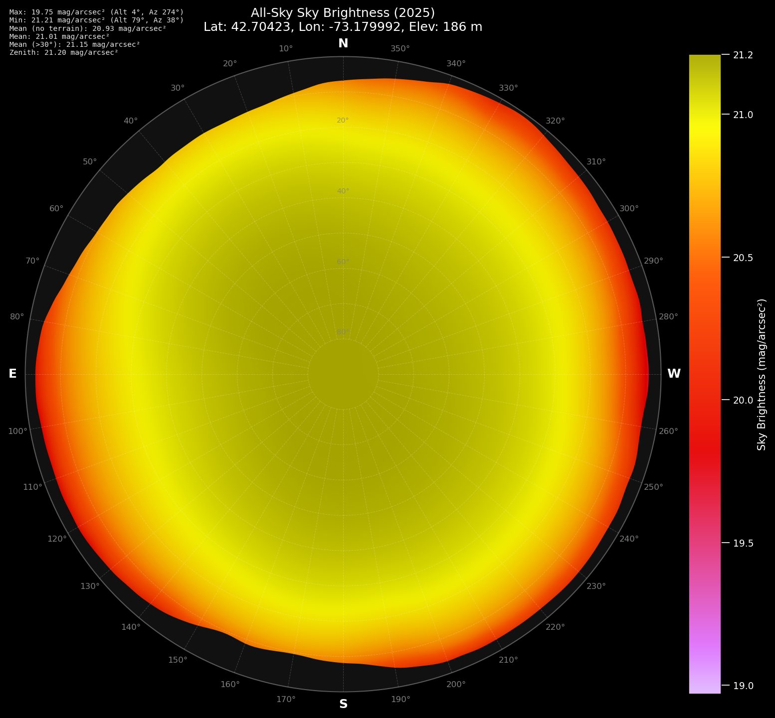
Start with the baseline. North Adams and Williamstown, at the base of Greylock, sit at about 186 meters. The all-sky map is uniformly yellow-orange from horizon to horizon.
There is no green in that map. Albany — only about 50 km to the west — dominates. The zenith reads 21.20, solidly Bortle 4. Usable for bright objects, limited for serious deep-sky work.
Now drive up to the summit.
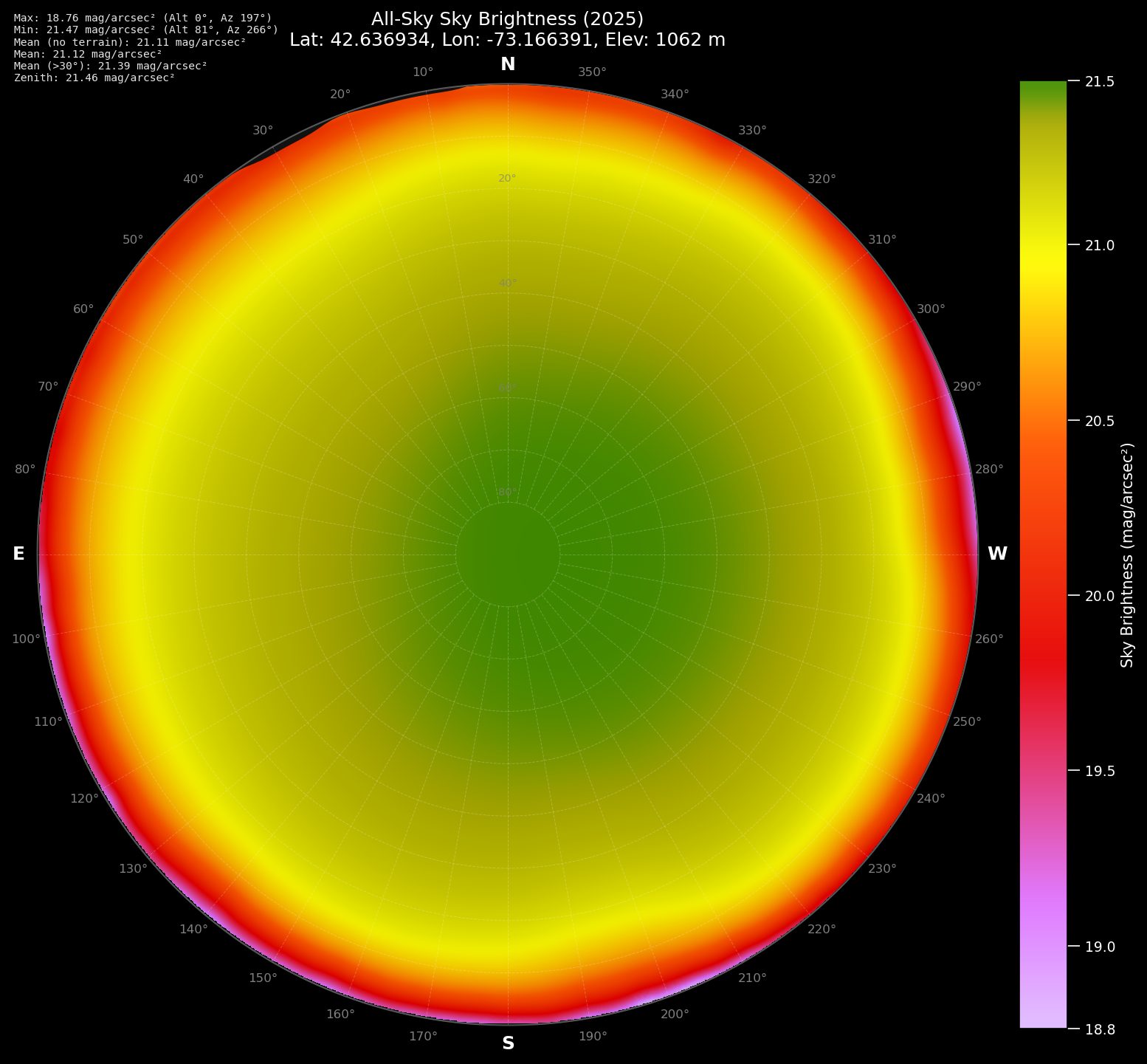
The summit map shows a perfectly smooth, radial gradient — the same signature as an open site with no terrain help at all. From 1,062 meters, Albany, Springfield, Pittsfield, Worcester, and the Route 2 corridor all have a direct line of sight to the observer. There is no terrain to block any of them, because you are above the terrain.
The satellite model’s terrain correction confirms it: “no terrain” predicted mean, 21.11; with terrain applied, 21.12. The terrain is contributing essentially nothing — exactly what you’d expect when you’re above everything.
Climbing 876 meters improves the zenith from 21.20 to 21.46, a gain of 0.26 mag/arcsec². Meanwhile, terrain-shielded Cummington at much lower elevation reaches 21.64, and Readsboro reaches 21.77. The mountain is outperformed by sites that put a ridge between themselves and the problem.
The practical issues compound the astronomical ones. Summit winds routinely exceed 50 km/h on nights that feel calm in the valley. Temperatures run 5–7°C colder at the summit; with wind chill, the effective temperature can be 15°C lower. Summit road access is restricted. A telescope on an exposed ridge in a 40 km/h wind doesn’t do useful work.
Altitude by itself is not the variable. Terrain geometry is.
Time Matters Too
Even at a fixed location pointing in a fixed direction, your effective Bortle class changes across the night and across the year.
The Moon
The Moon is the most dramatic short-term variable. A full Moon raises the sky background by approximately three magnitudes per square arcsecond — enough to shift a Bortle 4 sky to something resembling Bortle 7. That’s not “the Moon is annoying.” That’s “your semi-rural observing site just became, for tonight, approximately equivalent to a suburban back yard.”
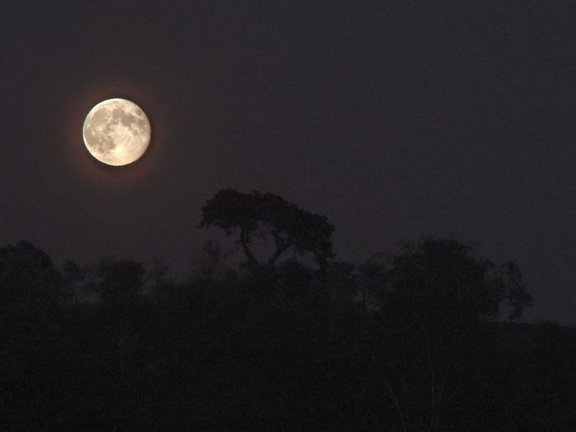
Even a half Moon is bright enough to wash out faint nebulae and galaxies. The practical consequence is that serious deep-sky observing centers on the two weeks bracketing new Moon, from last quarter through first quarter. A full Moon night is excellent for planets, double stars, and the Moon itself — none of which need a dark sky — but it is not an opportunity for the kind of work a Bortle 4 site is supposed to enable.
A site’s Bortle rating, implicitly, is always a moonless-night rating.
Atmospheric transparency and seasonal effects
Transparency — how well the atmosphere transmits light — affects sky brightness in a counterintuitive way. On nights of poor transparency, haze and aerosols scatter both starlight and city light more efficiently. Bad transparency makes light pollution worse: the aerosols that dim the stars also amplify the skyglow. Clear Outside and ClearDarkSky provide transparency forecasts worth checking before any session.
Seasonally, our Berkshire sites consistently read darker in summer than in winter by roughly half a magnitude — a real, measurable shift driven mostly by snow cover. Snow has high reflectivity (albedo around 0.8, compared to 0.1 for bare soil or pavement). Streetlights and fixtures that normally send downward light into dark asphalt suddenly find that light bouncing back upward into the sky. A city that produces a certain amount of skyglow in October produces significantly more in January, with no change to the fixtures themselves.
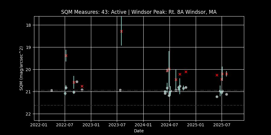
The gap between the dashed line and the actual readings is the satellite-vs-ground offset discussed above — visible here in three years of real data.
So When Someone Says “Bortle 4”…
They might mean any of these things:
They looked at a map. They visited lightpollutionmap.info (or a similar site), clicked on their location, and read the assigned class. That class is derived from VIIRS satellite data plus the site’s own calibration — which runs 0.3–0.5 mag/arcsec² more optimistic than a ground SQM reading, and uses a Bortle calibration that differs from Wikipedia’s. The number is real and useful but represents the zenith brightness on a clear, average night, with no information about what’s happening at the horizon.
They have an SQM and applied a calibration table. Their reading is a ground-truth measurement — more directly relevant than a satellite model — but the Bortle class they derived from it depends on which table they used. Wikipedia’s calibration (the de facto standard, since Unihedron explicitly defers to it) and lightpollutionmap.info’s calibration differ by up to a full class at the bright end of “good” skies.
They looked at the sky and used Bortle’s original visual benchmarks. This is the most direct method — and the most accurate to Bortle’s intent — but requires experience and conditions (no Moon, good transparency) to apply reliably. Few observers actually do this systematically.
They said “Bortle 4” and meant “the zenith on a good night.” In practice, this is almost always what the number represents. But the horizon in Springfield’s direction from their site might be Bortle 7. On a full-Moon night their zenith might be Bortle 7. Their summer average might be a third of a class better than their winter average.
None of this makes the Bortle scale useless — it’s a genuinely valuable shared language, and a Bortle 4 site really is meaningfully different from a Bortle 6 site. But it means the number is a starting point for a conversation, not an endpoint. When you hear “Bortle 4,” the follow-up questions are: measured how, at zenith or overall, at what time of year, and toward what part of the sky?
Resources
lightpollutionmap.info
This site deserves a sustained recommendation. Created as a labor of love by a single developer, it overlays VIIRS satellite sky brightness data on an interactive world map. You can zoom to any location, compare sites across a region, and use the all-sky polar projection view (shown throughout this article) to see how sky brightness varies across the entire sky from any point on Earth. The terrain model accounts for local topography.
For our area it reveals the full picture: Pittsfield to the south, Springfield to the southeast, Albany to the west — and the dark pockets in the Berkshires that our best sites exploit. Use it to scout sites before visiting them, and to understand exactly which direction your worst light domes come from.
Just remember: its Bortle class assignments reflect the VIIRS satellite calibration. Your SQM will read lower (brighter) than the map predicts.
SQM Observer Network
The SQM Observer Network maintains a growing database of long-term sky brightness data from networked automated SQM stations. Several stations are active in our region, including at Arunah Hill and Windsor Peak. Their time-series data show what satellite maps cannot: night-to-night variability. A “best case” reading on a transparent, new-Moon night can run a full magnitude darker than a hazy session at the same site. The spread in the data is as informative as the average.
Globe at Night
Globe at Night is a citizen science program that uses naked-eye star counts — Bortle’s original method — to build a global picture of light pollution. You count visible stars in a specific constellation and submit your observation. It’s the most direct connection to what Bortle was originally measuring, and an excellent way to involve newer observers.
Clear Dark Sky / Clear Outside
Both ClearDarkSky and Clear Outside provide astronomy-specific weather forecasts that include transparency and seeing alongside cloud cover. Transparency in particular is worth watching: a bad-transparency night at Bortle 4 can feel worse than a good-transparency night at Bortle 5.
The International Dark-Sky Association
DarkSky International certifies International Dark Sky Places and advocates for lighting policy. Their certification tiers (Gold > 21.75, Silver 21.0–21.74, Bronze 20.0–20.99 mag/arcsec²) provide a useful independent anchor for interpreting SQM readings — separate from the Bortle scale but grounded in the same instrument.